Reimagining Dr. Nut with a cohesive identity across branding, web, and advertising
Let's Work TogetherDr. Nut is a defunct brand that I redesigned as a part of the rebranding project. The goal of the project was to modernize the brand through a new visual identity, website and an advertising campaign.
This project focuses on turning an outdated product into a modern, market-ready brand.
I explored vintage soda brands like Dr Pepper along with modern beverage design trends.
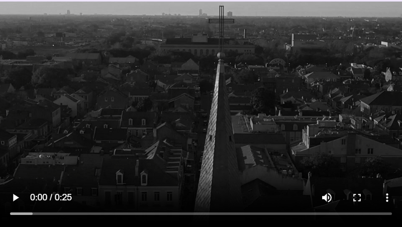
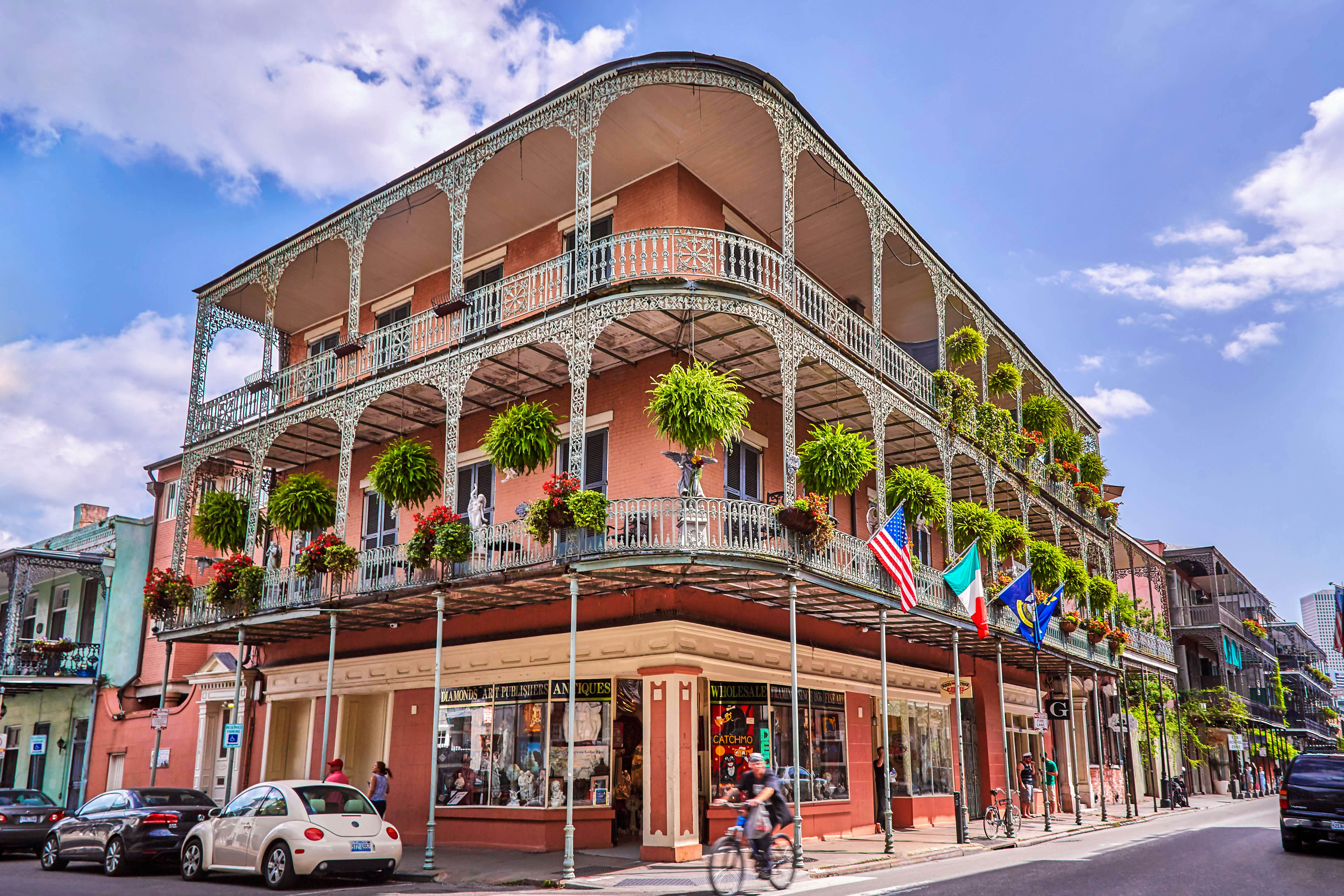
To give Dr. Nut a unique identity, I took inspiration from the visual culture of New Orleans — especially its vintage signage, jazz-era typography, and dark, moody nightlife aesthetic.
Key Takeaways
I led the complete rebranding of Dr. Nut, handling both the design and front-end development of the project.
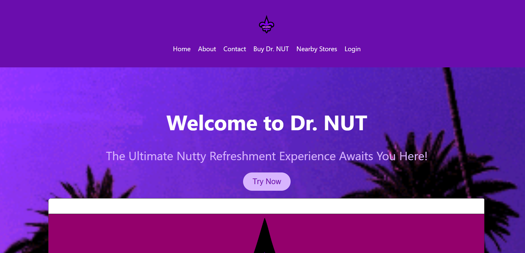
My responsibilities included creating the visual identity, designing the website layout, and developing the final responsive website using HTML, CSS, and JavaScript.
I also ensured consistency across branding, UI, and advertising to create a cohesive and modern user experience.
Tools: Figma, HTML, CSS, JavaScript
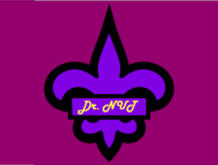
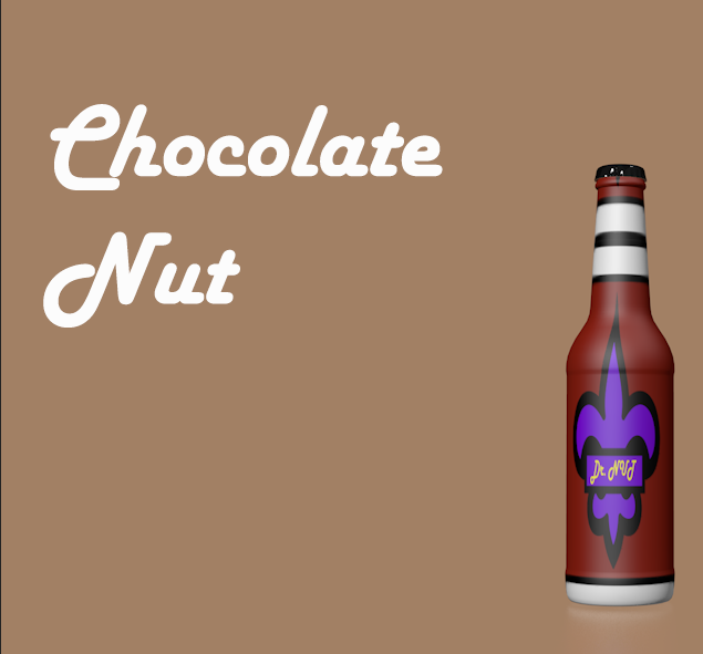
The final outcome is a complete rebrand of Dr. Nut with a strong, cohesive identity inspired by New Orleans.
The logo incorporates the fleur-de-lis symbol, referencing the city’s French heritage, while the typography is influenced by classic French-style lettering to create an elegant and distinctive look.
The brand uses a dark, minimal color palette combined with bold typography to achieve a premium yet slightly edgy feel. This visual identity was applied consistently across the packaging, website, and advertising, resulting in a modern and memorable brand ready for relaunch.
Want to see how this project was built? Explore the full source code, structure, and implementation details on GitHub.